Service
Product Design
UIUX Design
User Research
A/B Testing

Service
Client
Year
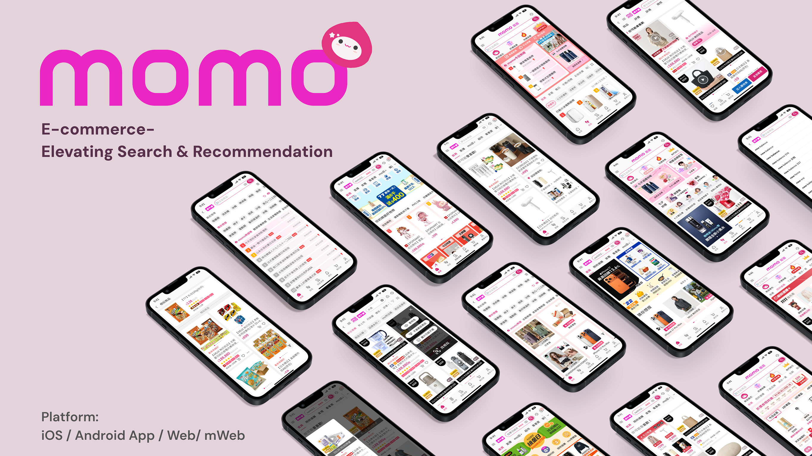
momo is Taiwan’s leading e-commerce platform, boasting an average of 1.7M+ Daily Active Users (DAU). At the heart of this massive operation lies the Search & Recommendation engine—the absolute core of the business. These two features alone drive over 50% of the daily traffic and contribute to more than 70% of the platform's total Gross Merchandise Volume (GMV).
Despite its market dominance, the platform began facing severe headwinds due to fierce market competition. We observed critical warning signs: DAU was slowly dropping, and overall revenue was facing downward pressure. A strategic deep dive revealed a core issue: the legacy Search and Recommendation features were no longer effectively meeting user needs. Shoppers were experiencing friction in product discovery, leading to decreased user stickiness and lost sales opportunities.
Stepping into this high-stakes environment, my mission was to act as the catalyst for change. As the lead designer for this domain, I was tasked with:
By aligning user needs with strategic business goals, the redesigned Search & Recommendation experience successfully eliminated product discovery friction. The new design not only revitalized user engagement but significantly drove bottom-line growth. Here is how we moved the needle at scale:
To achieve the business results highlighted above, a piecemeal design approach wouldn't suffice. I needed a holistic understanding of the entire e-commerce ecosystem. By mapping out the end-to-end shopper journey—from initial intent to final conversion—I was able to pinpoint exact friction points. The funnel below illustrates the strategic framework: decoding user mindsets at each stage, identifying design interventions, and measuring the localized impact that fueled our overarching success.

Looking closely at the user journey, it became evident that a one-size-fits-all solution would fail. Shoppers exhibit entirely different mindsets at various stages of the funnel—from casual browsing to high-intent searching. To effectively address these shifting psychological needs while navigating backend NDA constraints, I formulated a targeted UI/UX strategy.
Our approach was built on three core design pillars, ensuring every interface intervention was purposefully aligned with the user's current context:
Every extra tap is a potential drop-off. We aimed to reduce cognitive load by anticipating user needs and streamlining the filtering and sorting architecture.
Shoppers don't just want recommendations; they want the right recommendations at the right time. We shifted the UI focus from "generic lists" to "hyper-personalized, context-aware product cards."
The Foundation of Trust. To seamlessly serve 1.7M+ DAU without creating design debt, every new search and recommendation component was strictly aligned with momo’s Design System. This ensured a unified user experience while drastically reducing engineering overhead.
Equipped with these foundational principles, we audited the end-to-end user journey to identify where shoppers were experiencing the most friction. Instead of redesigning features in a vacuum, we focused our UI interventions on the most critical drop-off points impacting our DAU and GMV. Here is how we translated these business pain points into intuitive design solutions:
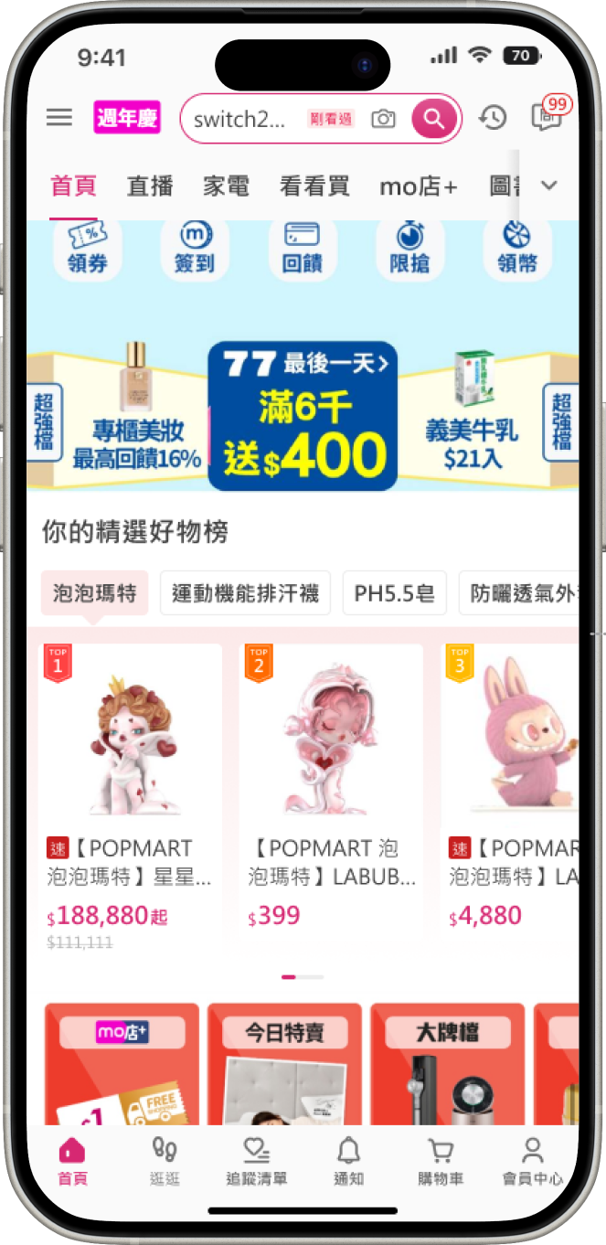
Data revealed a concerning decline in Search DAU. Our analysis uncovered a critical UX flaw: the search experience was entirely reactive. If users didn't have a specific item in mind and actively type it into the single, solitary search bar, we offered no inspiration. By relying on a single entry point and providing no proactive guidance, we were missing out on massive latent user intent and losing traffic.
To reverse this trend, we transformed the UI from passive to proactive. By analyzing user mindsets across different pages, I designed and strategically placed multiple new search entry points to prompt engagement before the user even formulated a query:
Immediately after a user clicks a product, the UI dynamically suggests 4 highly relevant keyword tags, capturing their immediate, localized interest.
Redesigned the search input state to greet users with personalized keyword suggestions based on their unique browsing history.
Introduced platform-wide trending search lists to provide social proof and inspire browsing users.


Data indicated a concerning drop in average session duration. While high-intent users successfully navigated via Search, low-intent "window shoppers" were bouncing rapidly. Their behavioral data sent a clear message: the app simply wasn't engaging to browse. The existing recommendation feed was a monotonous waterfall of identical product cards lacking contextual variety. Without dynamic layouts or deeply personalized curation hitting their specific interests, users experienced visual fatigue and abandoned the app after just a few scrolls.
To transform passive scrolling into active discovery, I designed a suite of diverse recommendation modules tailored to different stages of the user journey, specifically leveraging e-commerce psychology:

I designed a hybrid module that merges personalization with social proof. By generating dynamic rankings based on the user’s unique search and browsing history, the UI not only suggests highly relevant items but also implies trustworthiness ("others are buying this"), significantly lowering the barrier to click.
Knowing our user base is highly price-sensitive, we integrated personalized, limited-time offers directly into the infinite scroll. I used distinct, high-contrast UI treatments to highlight these deals, creating powerful visual pattern interrupts that break the monotony of the waterfall and trigger impulse engagement.
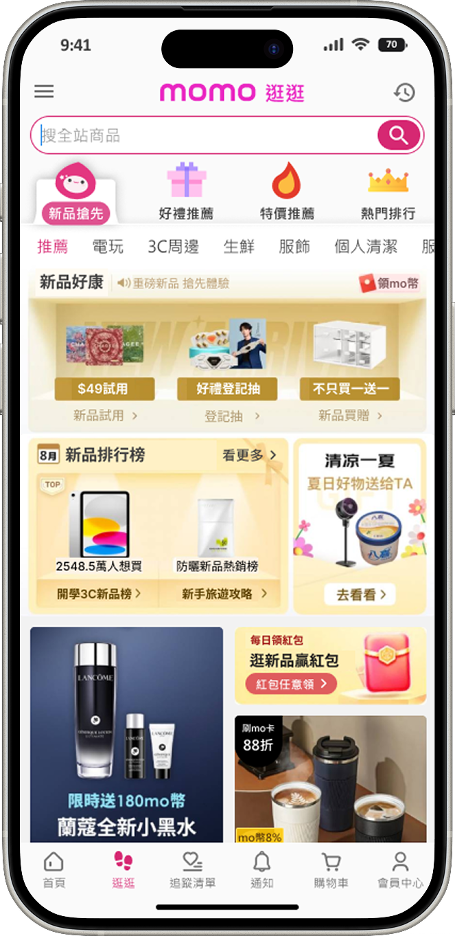
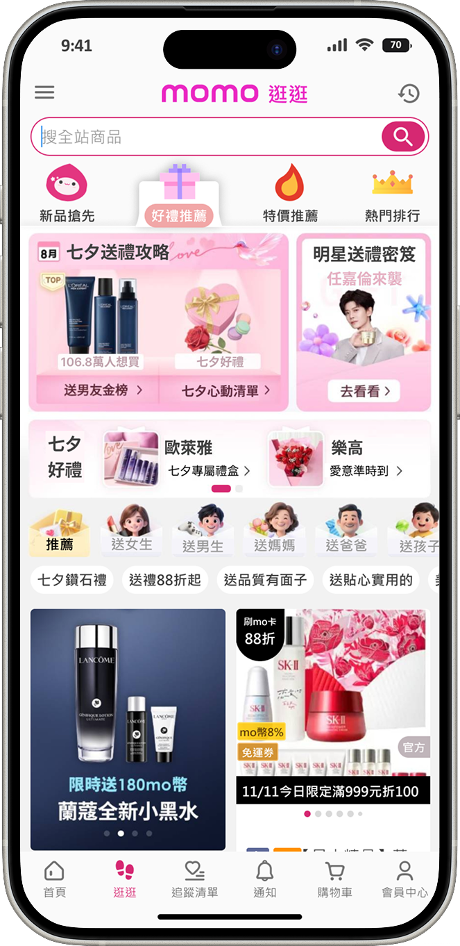
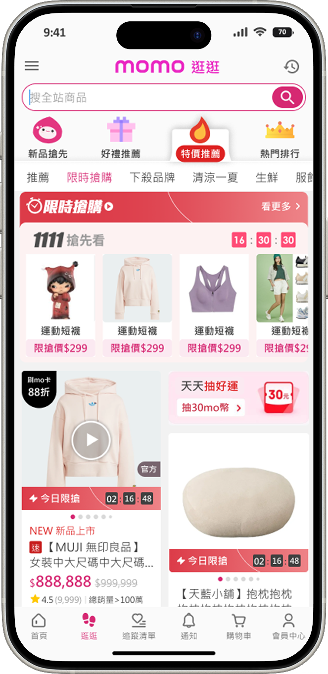
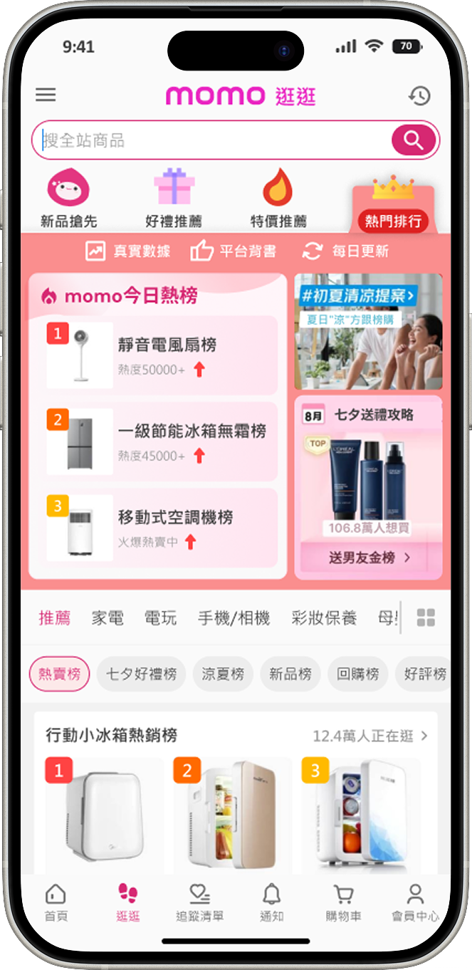
Despite occupying a premium spot on the bottom navigation bar—a theoretical "golden entry point"—one specific tab suffered from alarmingly low DAU. My UX investigation revealed a stark mismatch between its high accessibility and its actual value. The page was merely a monolithic, uninspiring waterfall of products. Users quickly learned it lacked browsability and inspiration, developing "banner blindness" toward this crucial navigational element and abandoning the tab entirely.
To reclaim this wasted real estate, I spearheaded a complete overhaul of the page's Information Architecture (IA) and user flow. Partnering closely with the Marketing team, I transformed this dead zone into a dynamic destination for users wanting to "just browse and get inspired." We restructured the page into four strategically curated pillars that aligned perfectly with current business operations:
By replacing the single-feed layout with these diversified, context-specific UI modules, we successfully revitalized a neglected touchpoint into a highly engaging and profitable browsing destination.


1.Data + Empathy :
Data showed where users dropped off; empathy revealed why. I learned that my true value is translating raw algorithmic power into intuitive, human-centered experiences.
2.Scalability via Systems :
Designing for 1.7M+ DAU requires strict discipline. By leveraging and expanding momo’s Design System, we ensured platform-wide consistency and zero design debt for the engineering team.
3.Cross-Functional Synergy :
Impact isn't created in a silo. Collaborating deeply with Marketing and Data Science proved that the most successful UX solutions are tightly aligned with business strategies.