Service
Brand Design
UI & UX
Product Design

Service
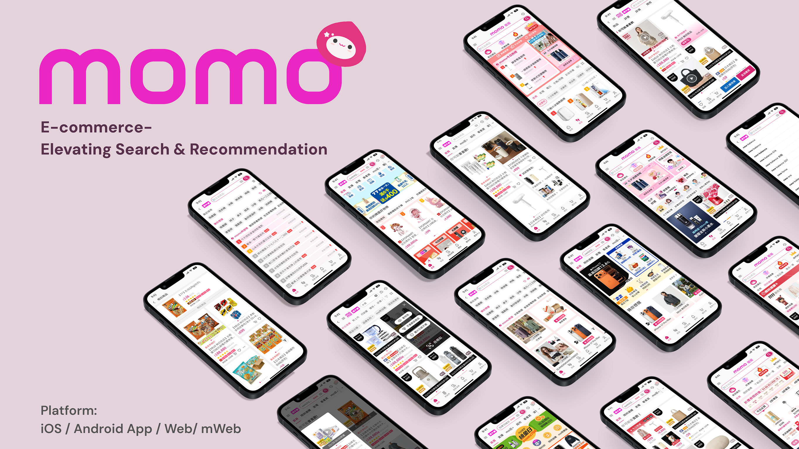
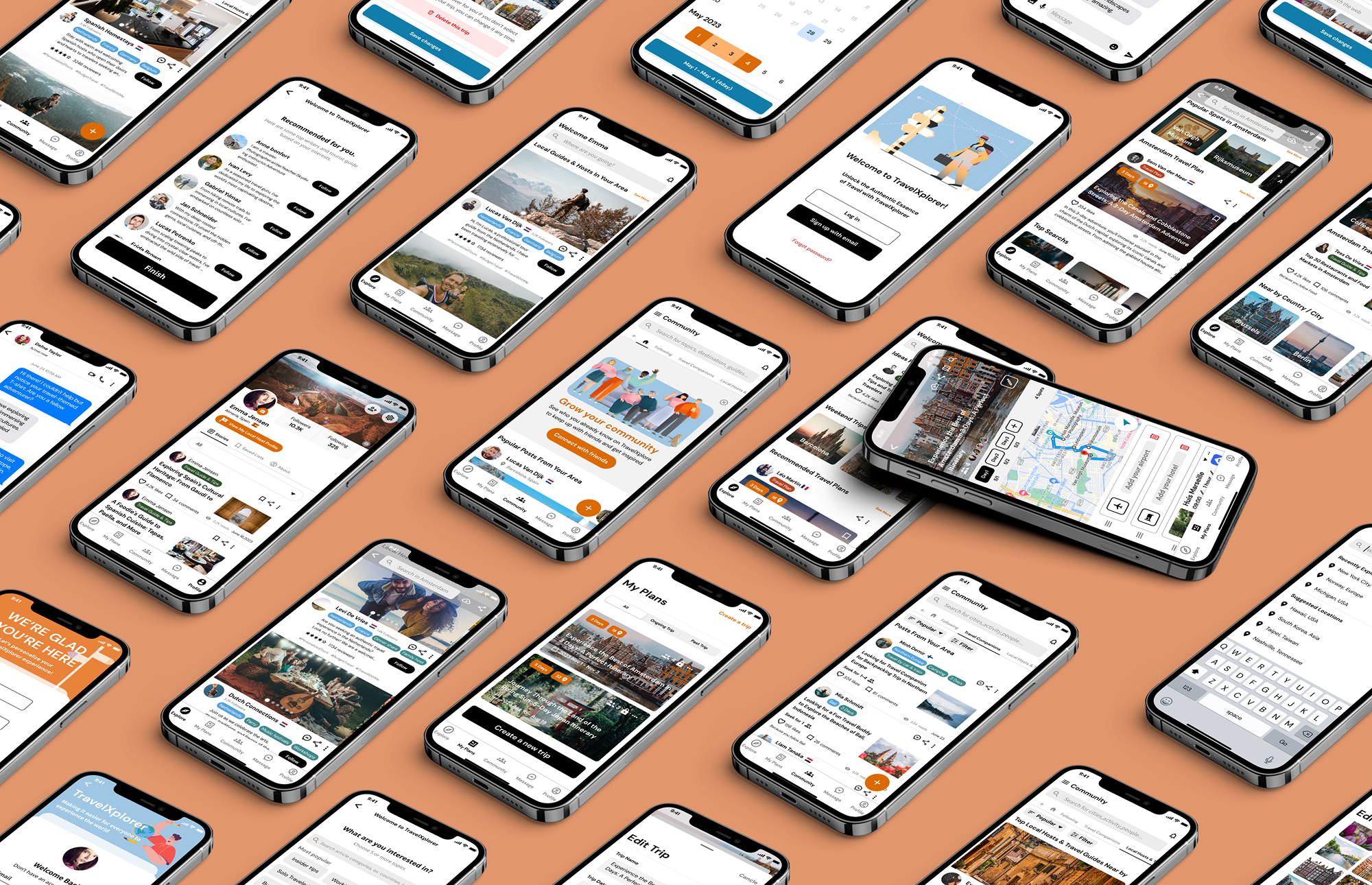
Client
Year
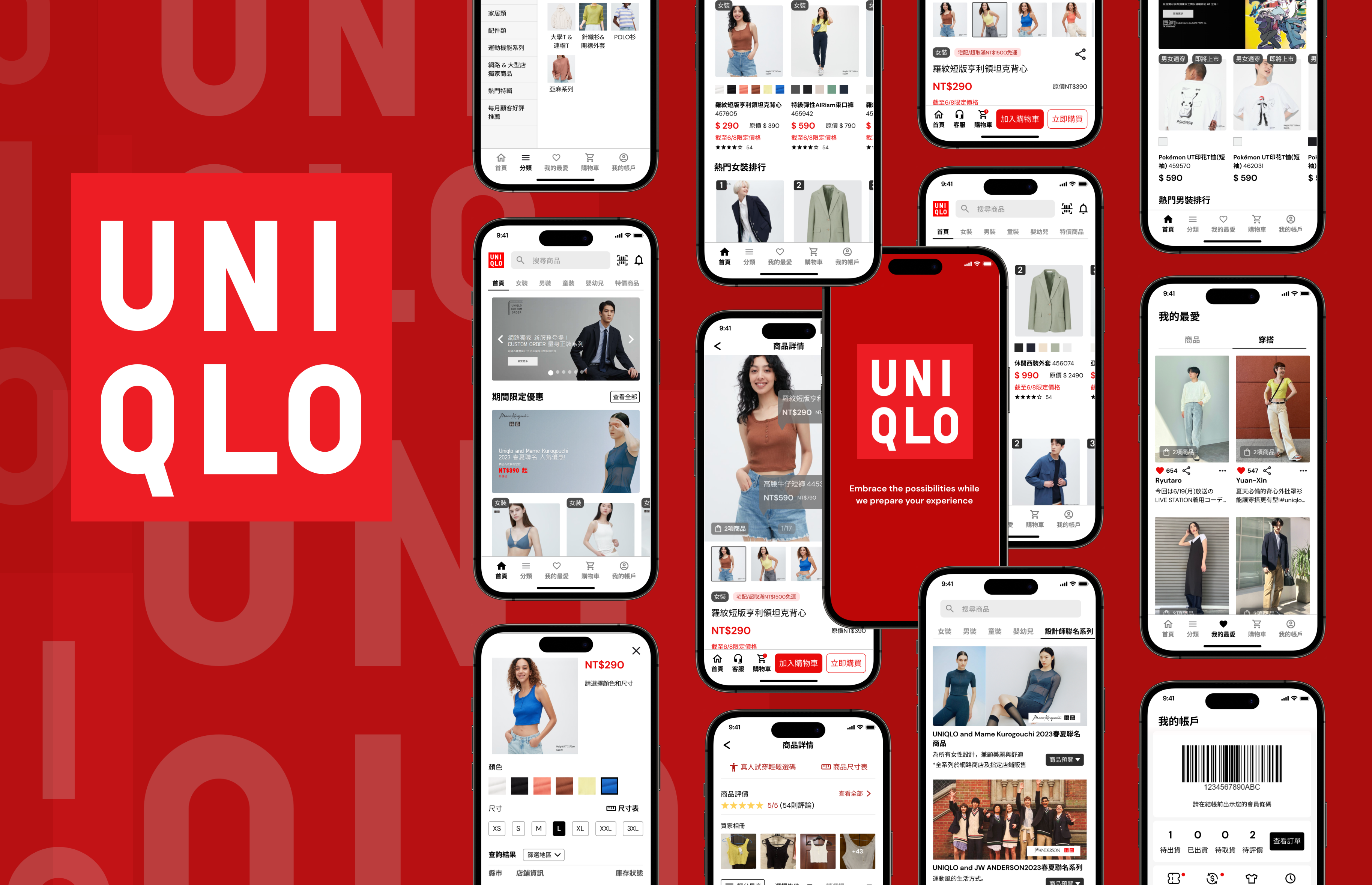
UNIQLO is a renowned global fashion brand that offers high-quality and affordable clothing for men, women, and children. However, the current experience presents several challenges such as unclear information hierarchy, unfriendly user workflows, and other issues.
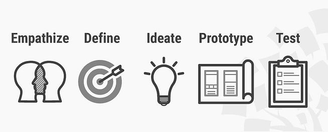
Design thinking is a human-centered approach to problem-solving that is used to create innovative and effective solutions. It can help me focus on understanding the needs and perspectives of the users, identifying the underlying problems, and exploring and testing different solutions.
The first stage of design thinking is to empathize with the users. This involves understanding their needs, goals, and pain points. It can be done through user research, surveys, interviews, and observations. For this research, I used Typeform to collect data from the respondents.
Secondary research in UI/UX refers to the process of collecting and analyzing existing data and information that has been previously gathered by other sources. This can include published articles, academic research, industry reports, user feedback, and competitor analysis.
By looking at case studies, articles, reviews of App Store and Play Store, etc, I found several problems that are often highlighted on the UNIQLO app, such as :
To get a better understanding of whom I was designing for:
I conducted this survey via Typeform, and gathered responses from approximately 50 participants, exploring their usage patterns, motivations for using the app, and the challenges they encountered. Additionally, participants were asked to provide their opinions on the common criticisms regarding the usability issues of UNIQLO APP mentioned by other online users.
Among the 30 participants, there were 25 males and 25 females. 90% of the respondents were aged between 18 and 30, while 10% of the respondents were aged between 30 and 50. I felt like this was a fair representative sample of UNIQLO's current user base since it aligns with its target audience in the market.
Some of the summaries that I obtained when conducting the survey and divided into three initial research results :
_EN.png)
I created a user persona based on the research results to understand user behavior, needs, experience, and goals.
.png)
The next step is creating a model of user journey map. The user journey map is a visualization of the process a user goes through in achieving goals. I also used this to inform my design decisions.
In this stage, I create low-fidelity prototypes to test the ideas and validate the assumptions. This makes improvements also involves brainstorming, sketching, and creating rough prototypes. Before designing the prototypes, I also made a solution idea, affinity diagram, prioritization idea
A solution idea involves understanding the needs and preferences of the target users, creating designs that address their pain points and provide a seamless user experience. These are solutions I have made for users.
_EN.png)
An affinity diagram is a tool used in design thinking and UX to organize and categorize ideas, information, or data. It allows me to see the big picture and identify any opportunities or pain points in the user journey.
To prioritize design elements for this steps, I used a simple priority matrix (High/Low impact, High/Low effort).
.png)
This is what the early wireframes looked like. I used Mid-Fidelity Design for the wireframe because it typically involves more detailed representations of the layout, structure, and functionality of the product than low-fidelity design but with less detail and visual polish than high-fidelity designs.
To validate my designs and test prototypes, I turn these ideas into high-fidelity designs, then conduct a face-to-face usability test with 5 people. I asked the participants to complete several scenarios using the current version of the app and the redesigned version. Then record the time users took to complete the tasks and observe their movement patterns, mental models, and ability to complete their goals. Through multiple rounds of feedback, I was able to decrease the cognitive load of our users and make key information more accessible at a higher level.
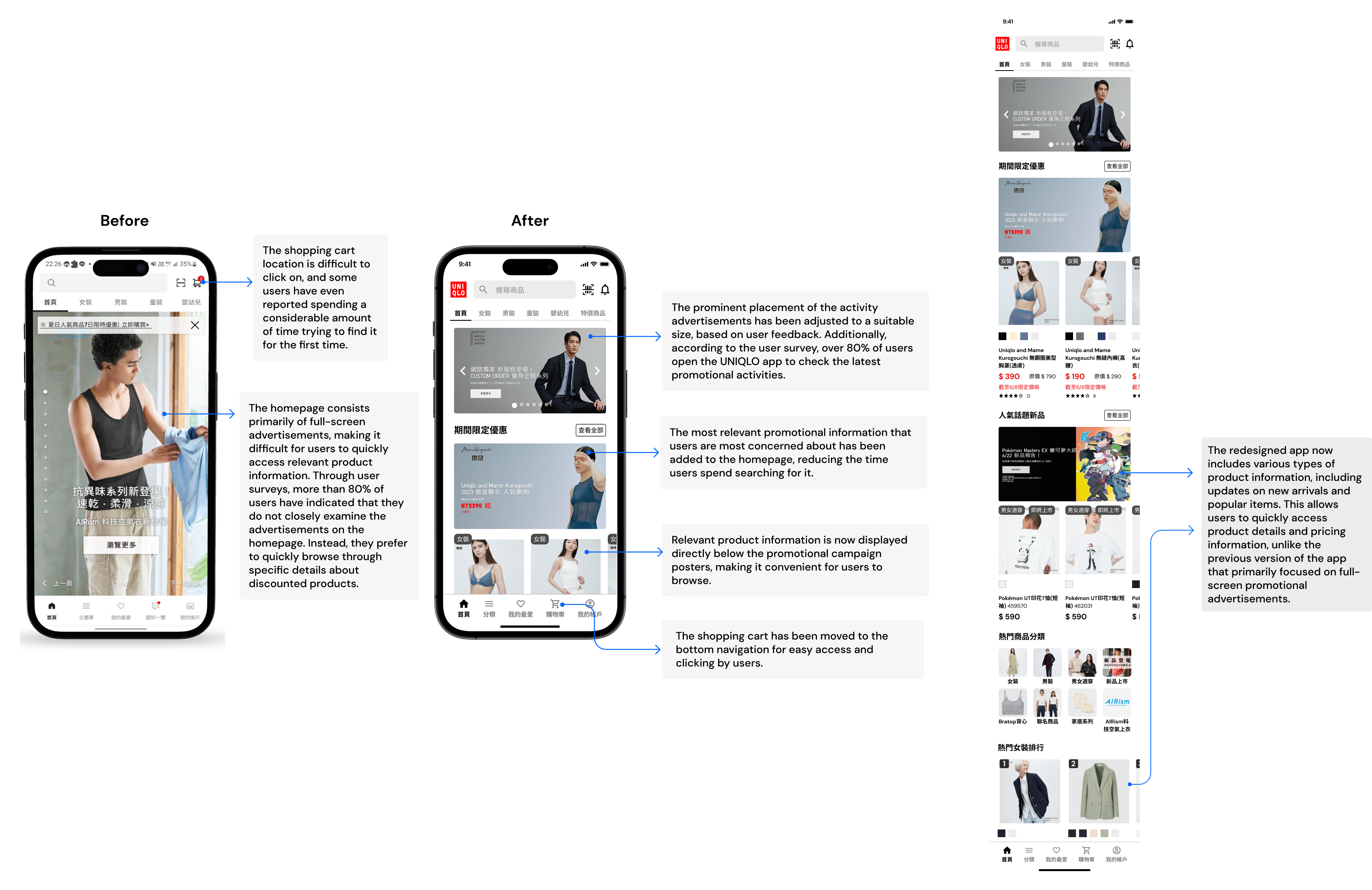
Through user surveys, more than 80% of users have indicated that they do not closely examine the advertisements on the homepage. Instead, they prefer to quickly browse through specific details about discounted products.
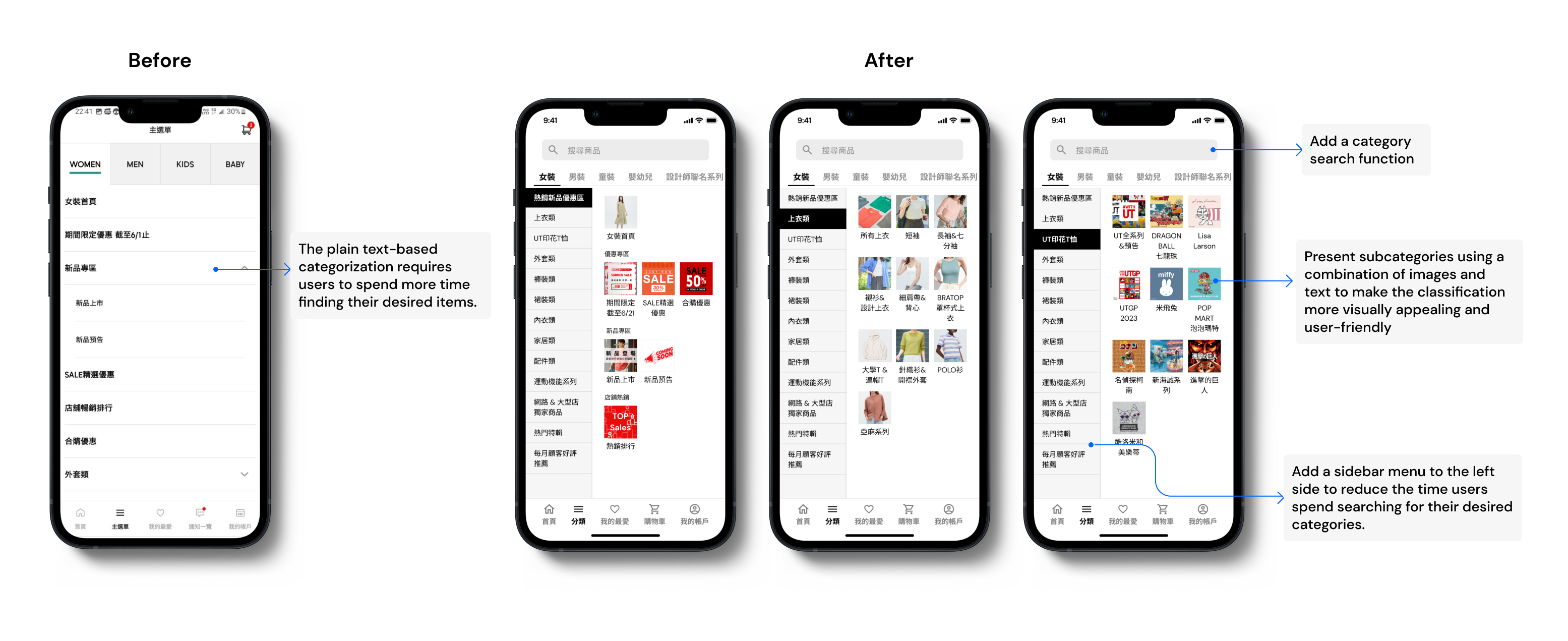
Like the homepage, improve the oversized ad content and add "All Women's Clothing" for users who don't have a specific item in mind to browse casually.
.png)
.png)
People can now navigate to find new things easily. Detailed breakdown below.
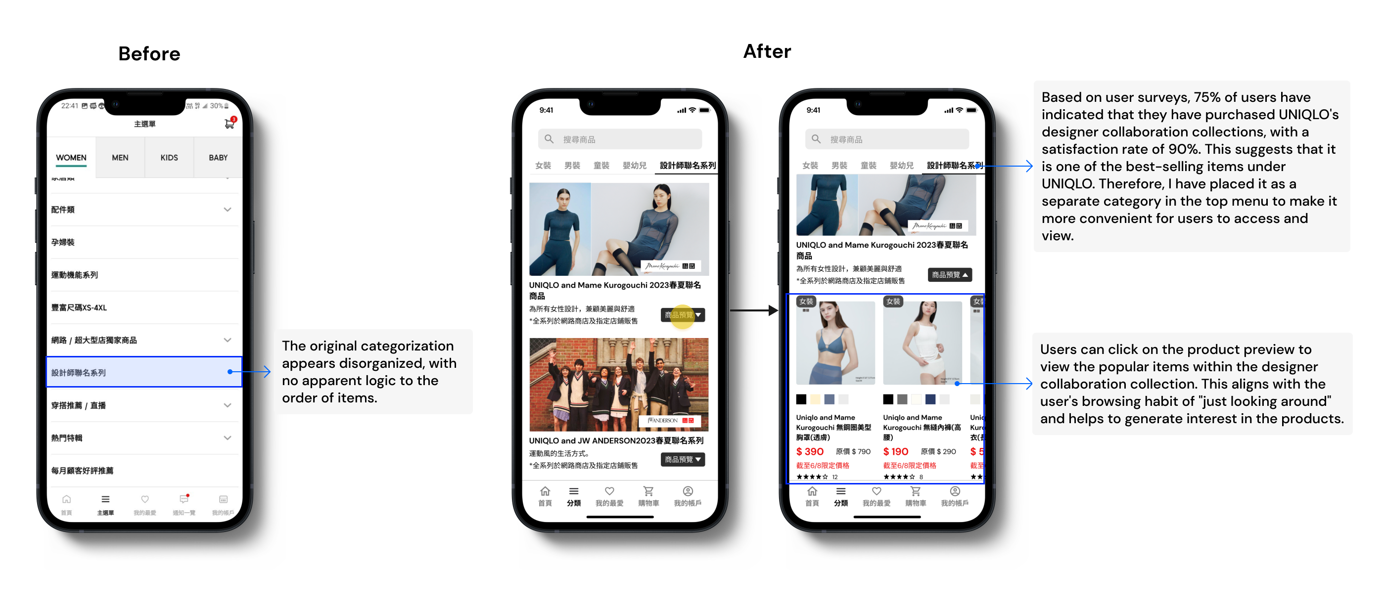
Based on my surveys, 75% of users have indicated that they have purchased UNIQLO's designer collaboration collections, with a satisfaction rate of 90%. This suggests that it is one of the best-selling items under UNIQLO. Therefore, I have placed it as a separate category in the top menu to make it more convenient for users to access and view.
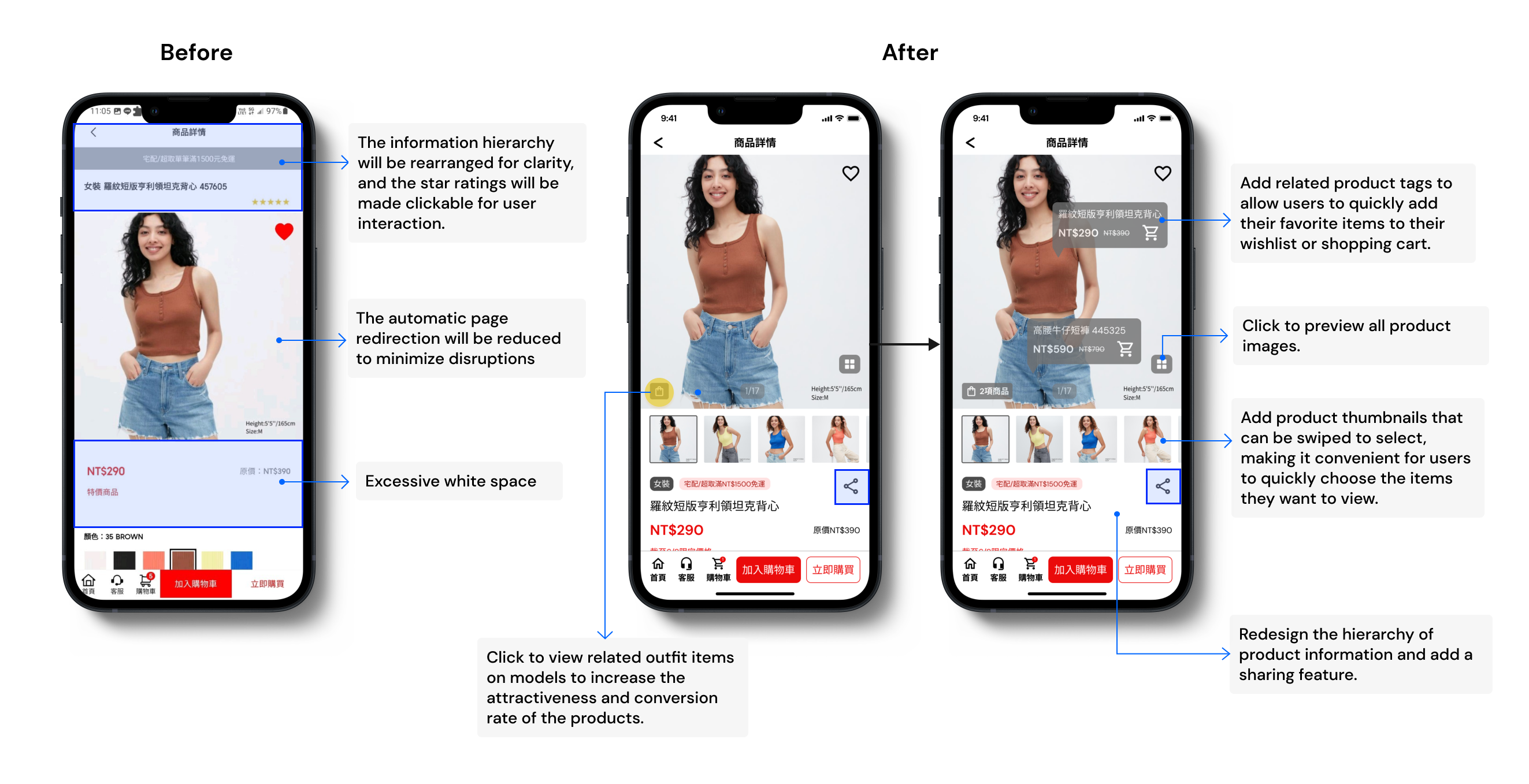
I rearranged the information on the product detail page to tell a better story. Showcase related products or accessories that complement the item being viewed, encouraging users to explore more options.
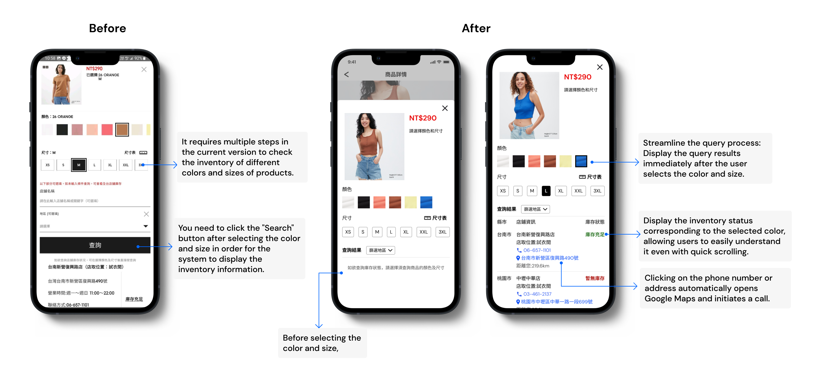
This is one of the most challenging features reported by users in terms of usability. The issue lies in the fact that users have to repeatedly click the "Search" button after selecting the color and size. Additionally, the presentation of the stores does not facilitate easy and quick identification of the desired option.
According to my user research, over 75% of users have expressed that having real-life photos from other buyers would help them make purchasing decisions more quickly. However, the current product reviews consist only of text.
.png)
I have made enhancements to improve the user experience, such as adding clear progress indicators and implementing automatic retrieval of recipient information. Detailed breakdown below:
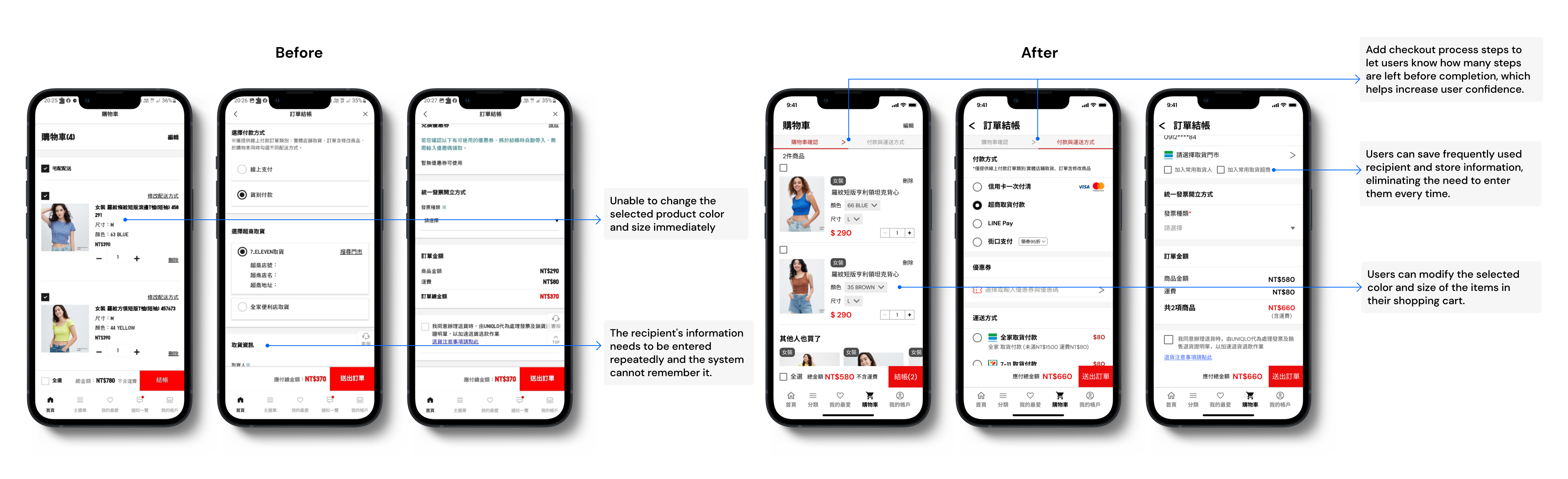
Previously, all information was presented in a single linear layout. After multiple iterations and user research, I have redesigned the layout of the app by reorganizing the order tracking feature and the integration of UNIQLO's flagship app: Style Hint
.png)
With this project, I learned the role visual design plays in reflecting the mission and values of a brand. It is so important (and SO difficult) to spend time developing the visual design aesthetic to convey what the brand means to millions of users.
Furthermore, conducting thorough user research is crucial in understanding the pain points, preferences, and needs of the target audience. By gathering user insights and feedback, we gained a deeper understanding of their expectations and were able to address their specific needs in the redesign.
As I solely focused on user research for this design optimization, it is important to note that design also needs to consider the business considerations of the brand. This includes UNIQLO's market strategy and sales process in order to develop the app's user flow. Therefore, I hope to incorporate both user and business perspectives more comprehensively in future implementations to make the best design decisions.